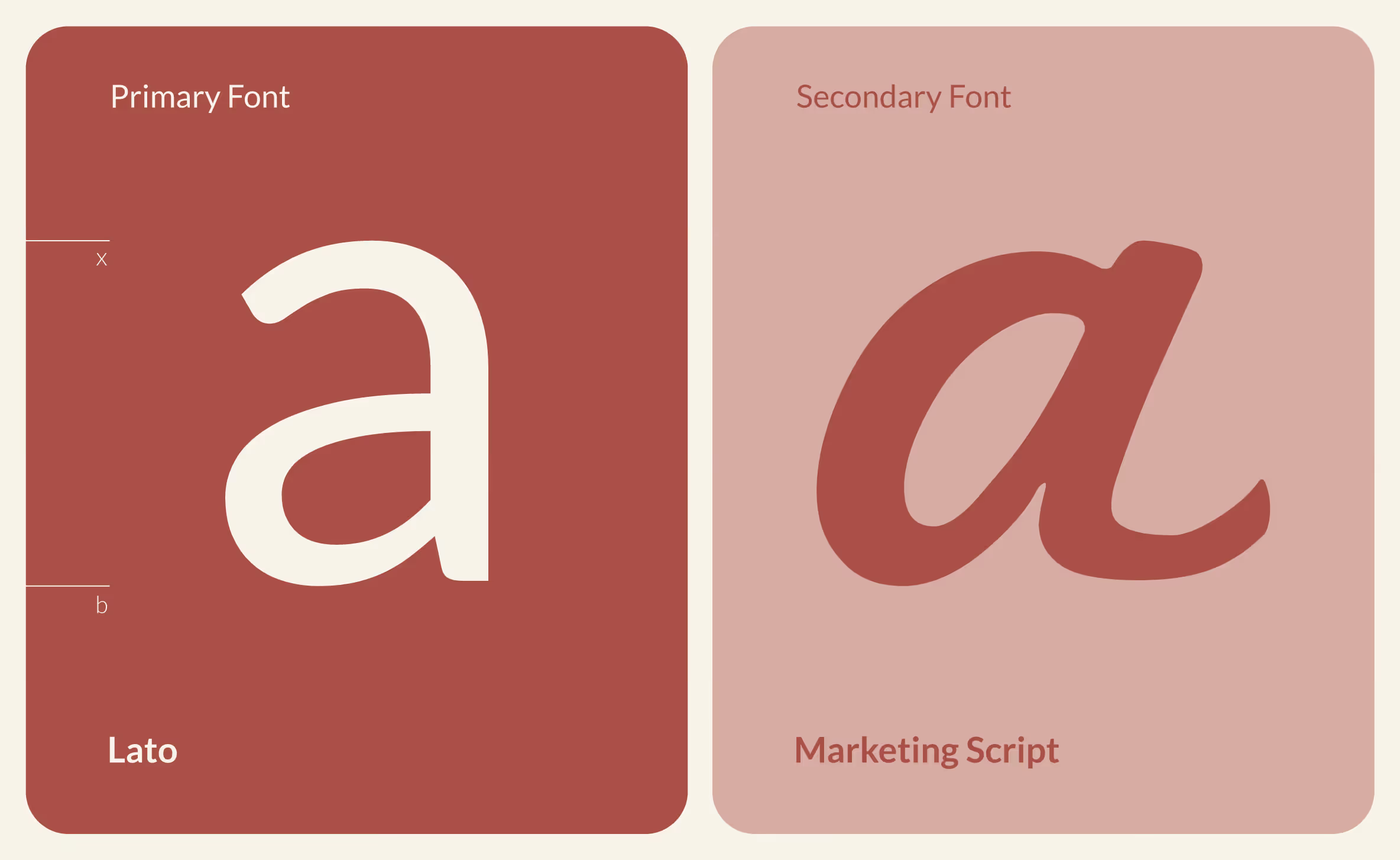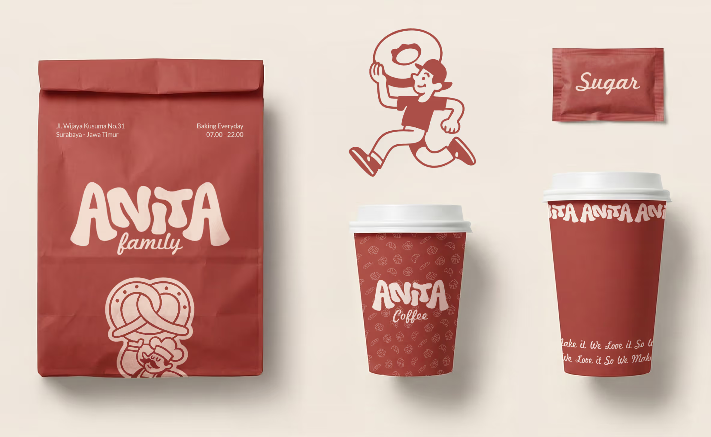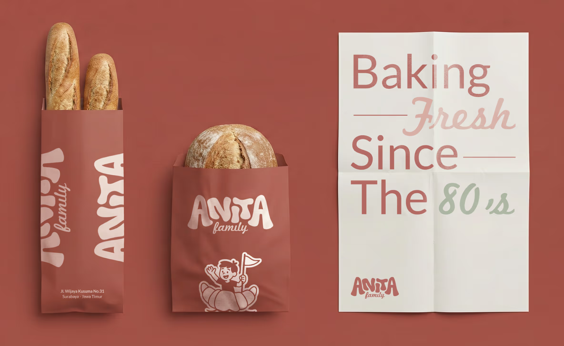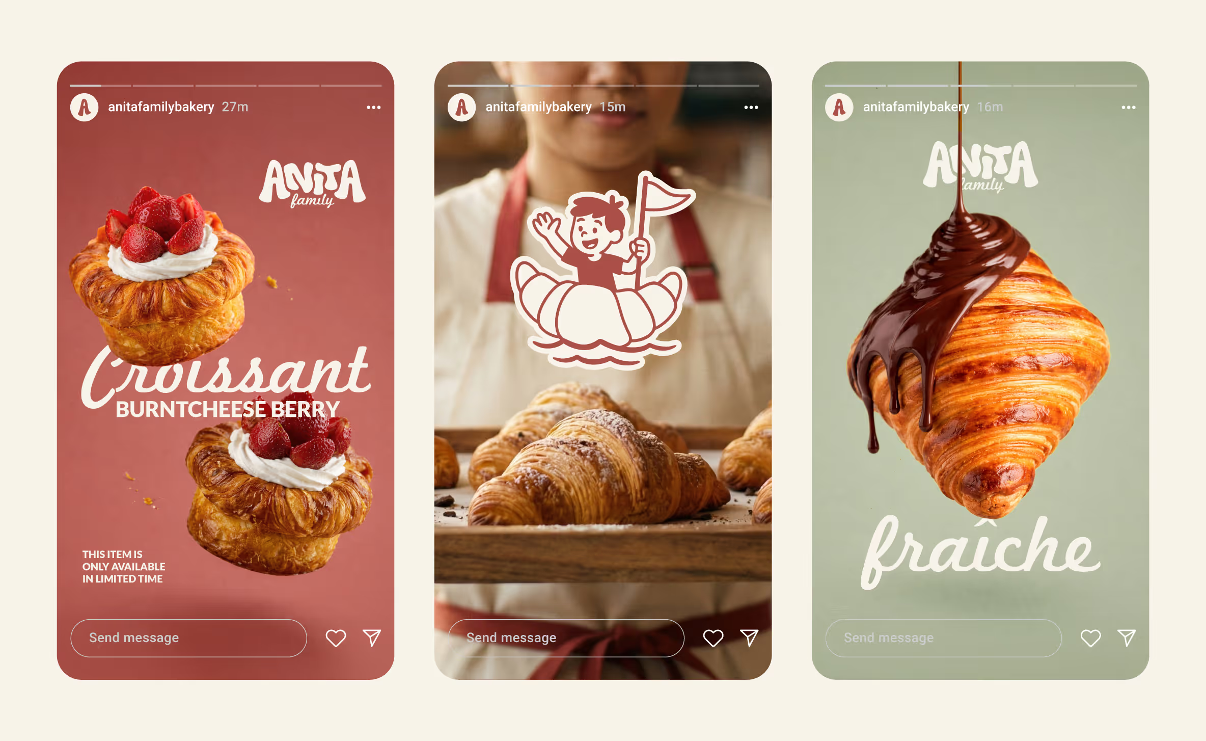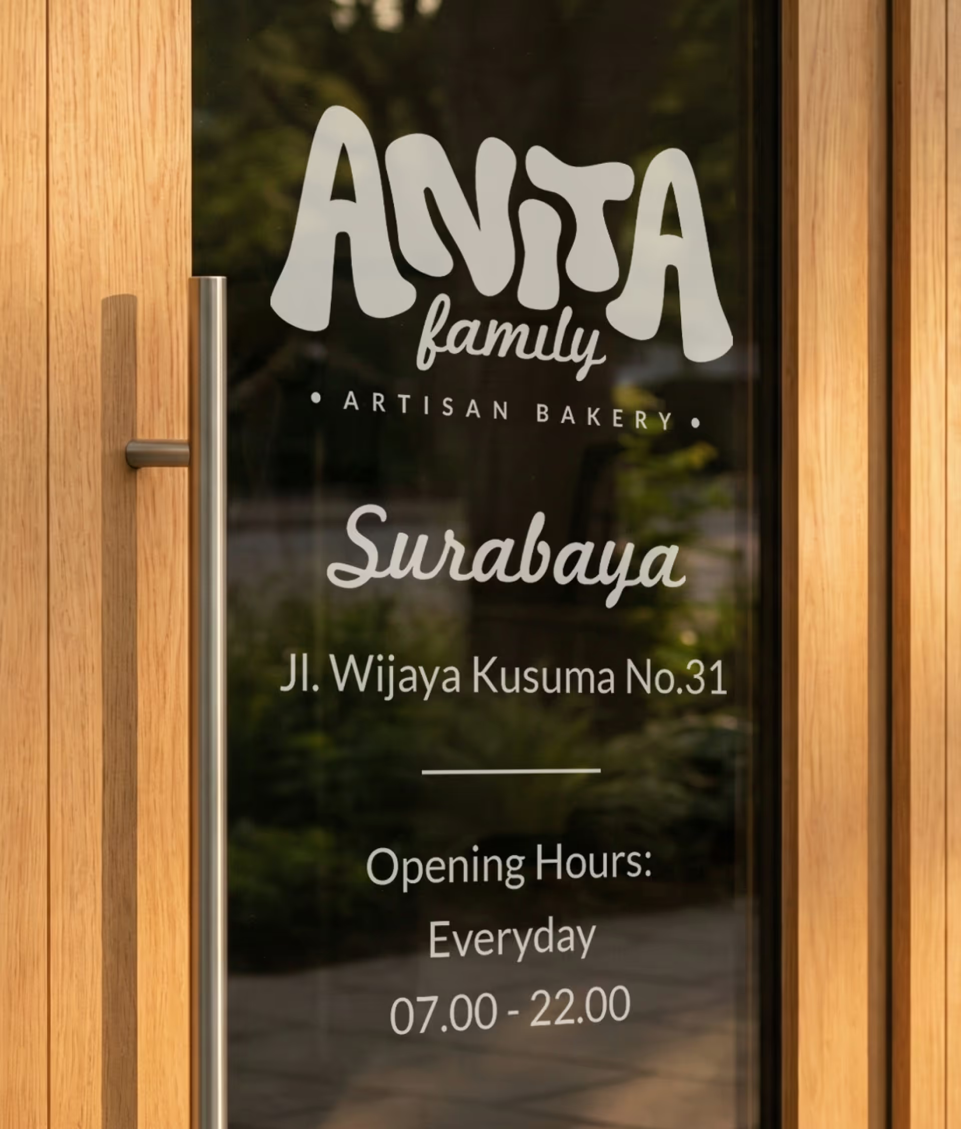
Anita’s rebranding is a gentle but intentional shift, a refined identity built to feel young, modern, human, and quietly confident. The project redefines Anita through clarity, simplicity and a visual language that speaks softly but leaves a lasting impression. The new identity doesn’t shout, it resonates.
The concept is rooted in calm confidence. Every element, shape, space, type and tone was designed to reflect a brand that knows who it is, who it is for and where it’s going.
Part of the rebrand focused on making Anita feel younger, fresher, and more in tune with a new generation. Rather than relying on loud colors or trends, the approach was subtler, capturing youthfulness through clarity, energy, and simplicity.