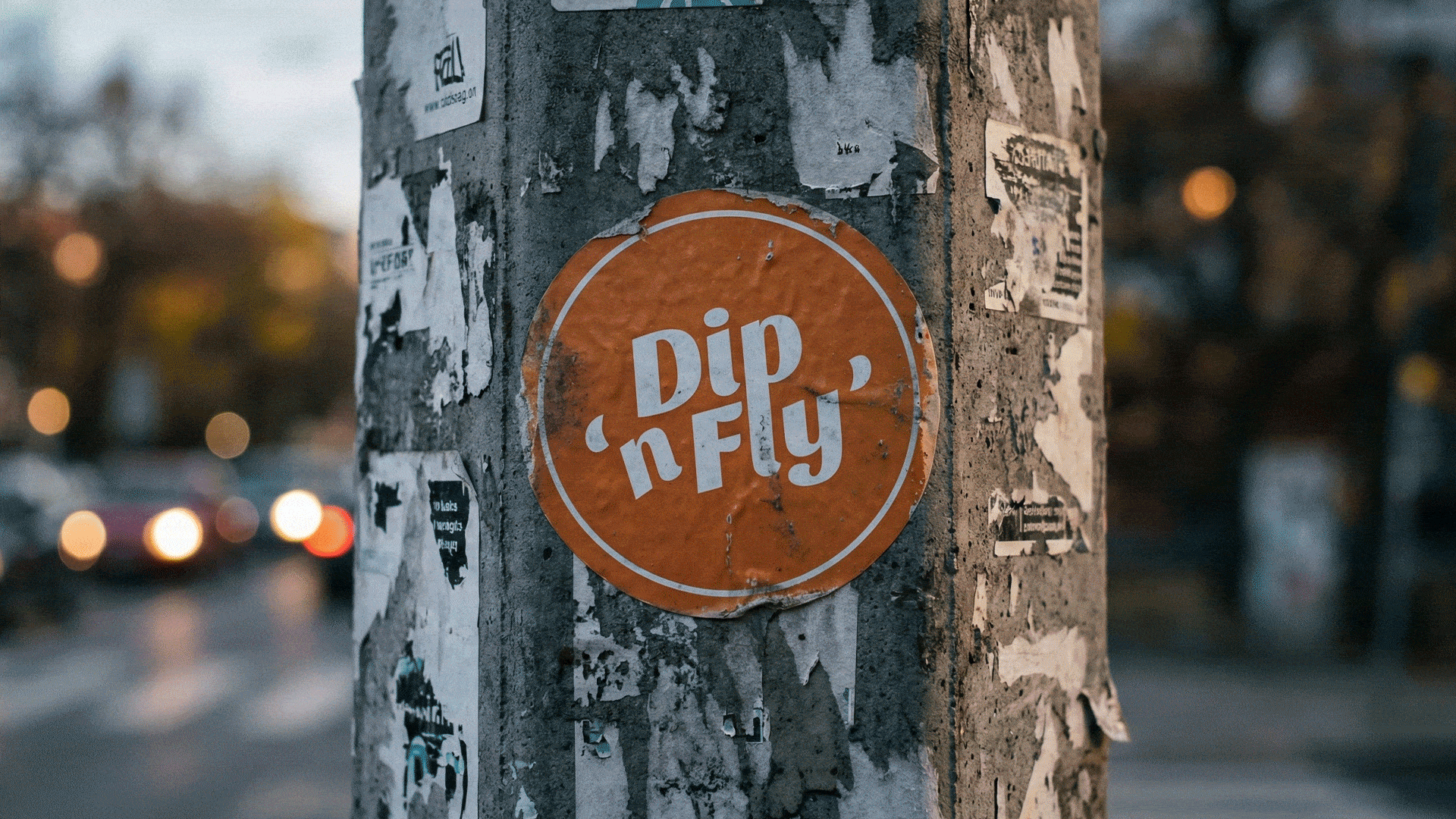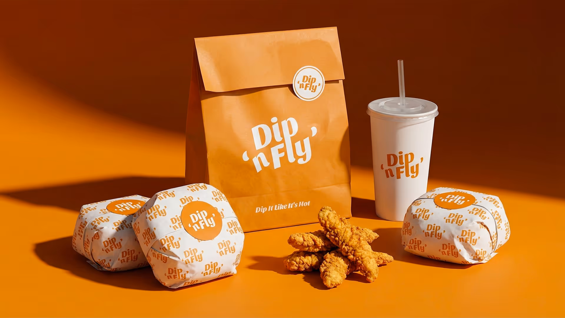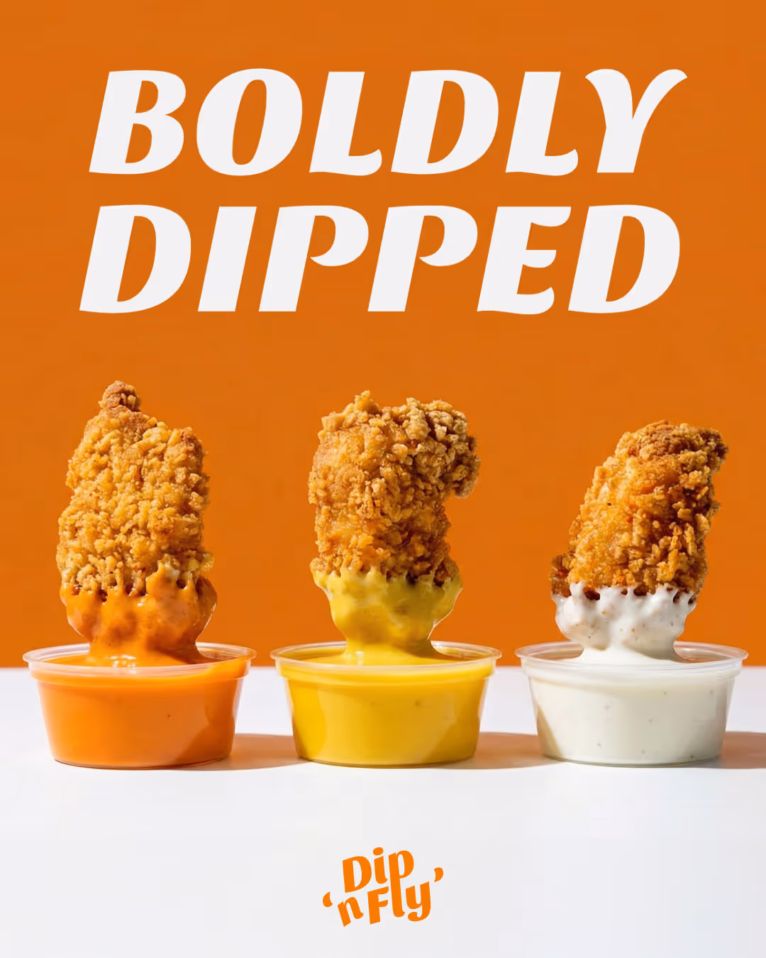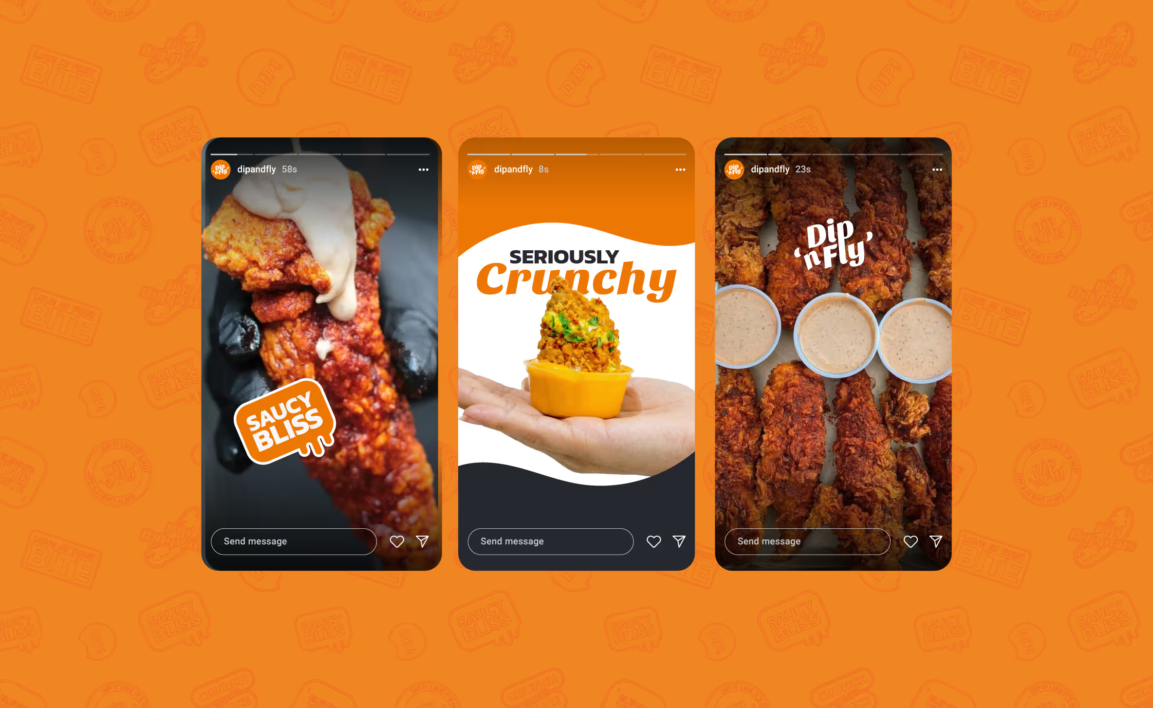
Dip n Fly is a chicken finger brand built around one idea: the dip is the experience.
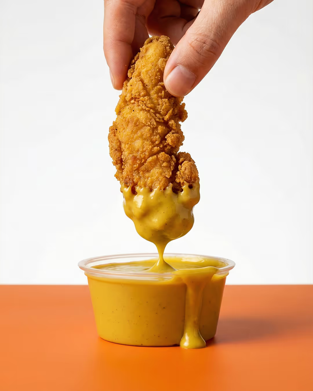
Instead of treating sauce as an add-on, the brand was designed around the moment where crunch meets flow. That pause before the bite became the foundation for the visual system, influencing everything from the logo structure to the way the product is presented.
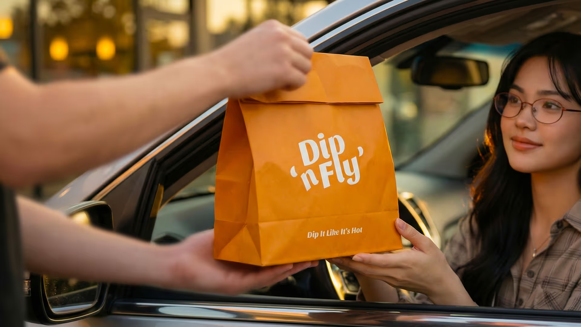
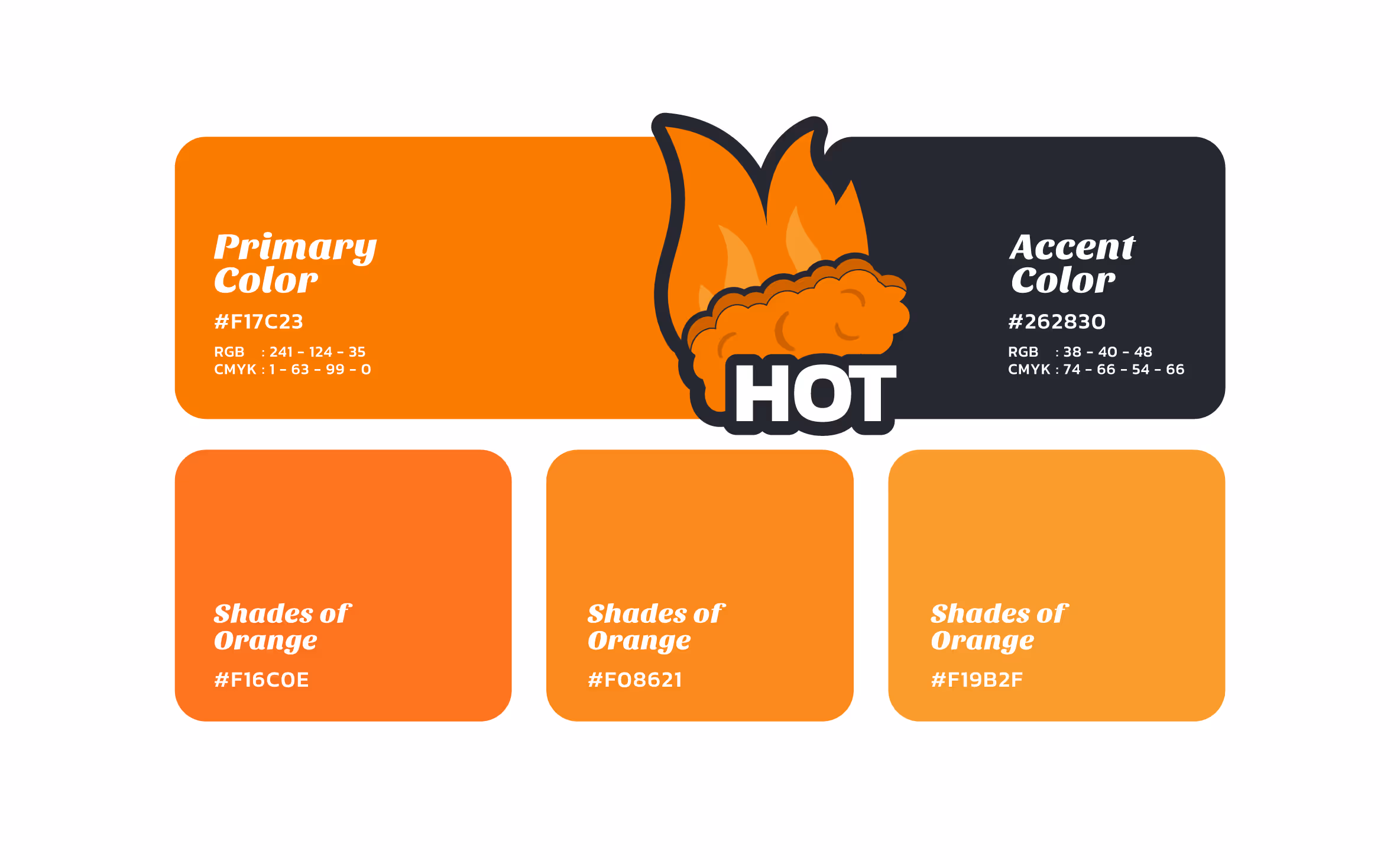
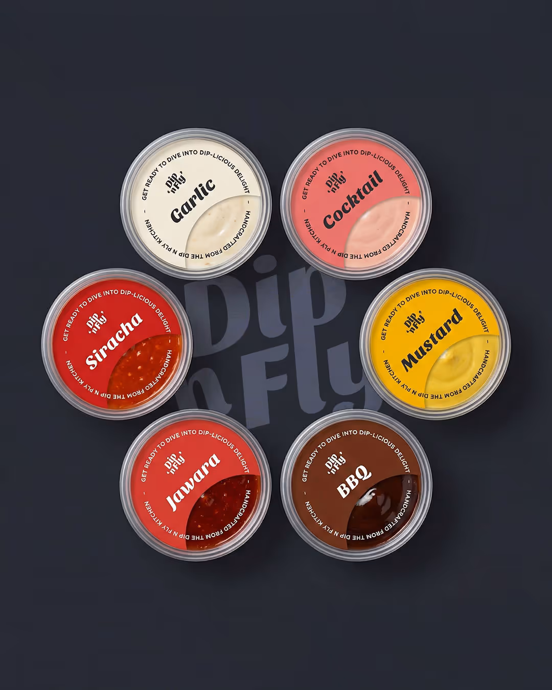
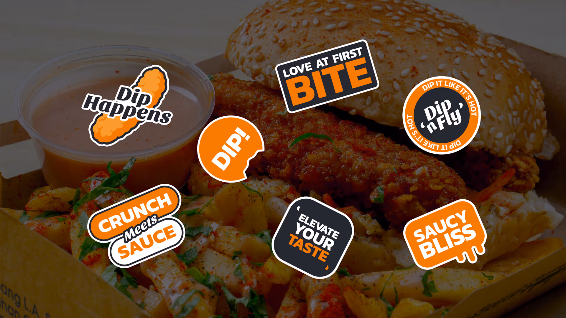
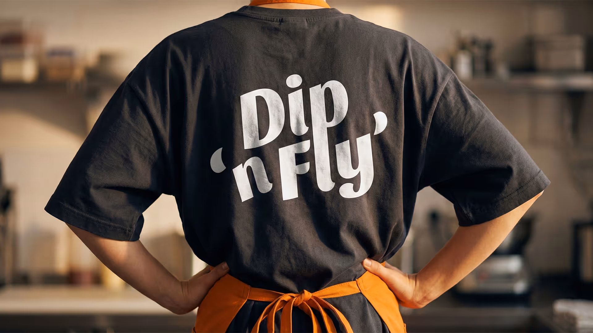
The identity balances energy and discipline. A bold, appetite-led color palette and expressive visual language are anchored by a clean, grid-based logo and a restrained typographic system. Every element was designed to be repeatable, scalable, and instantly recognizable.
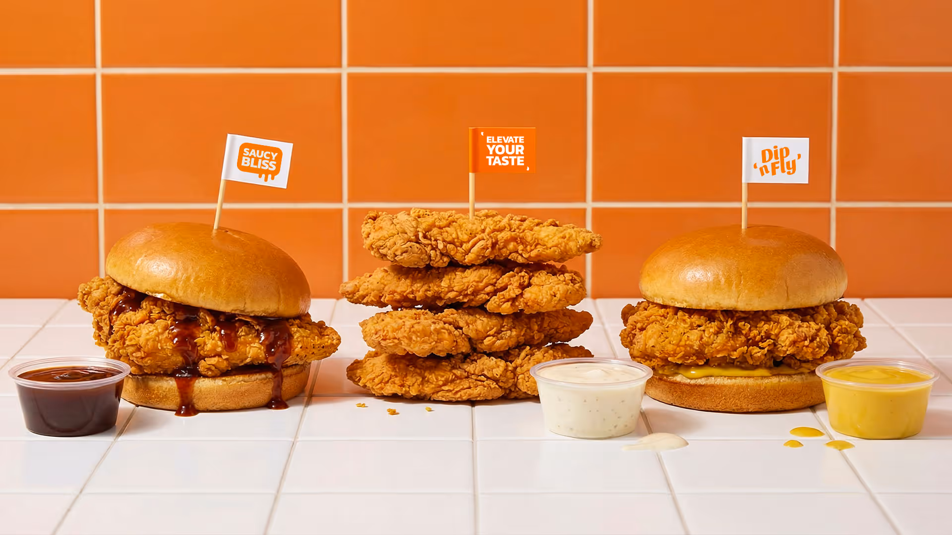
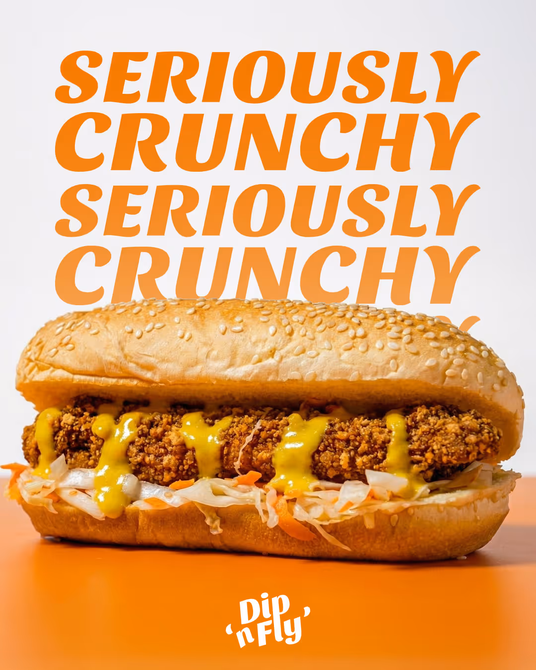
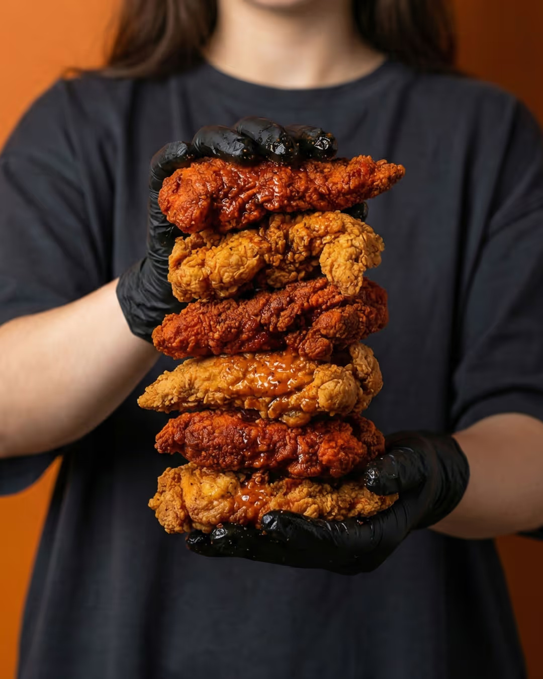
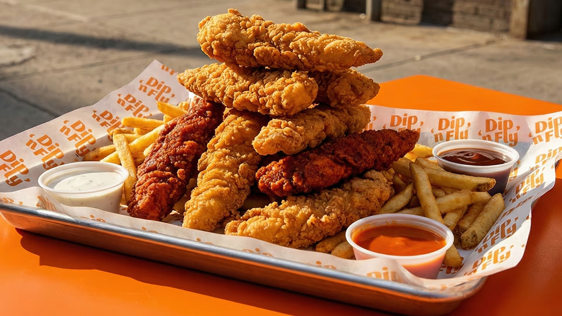
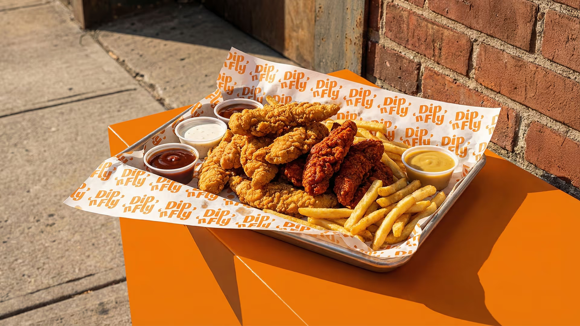
All product visuals were art-directed as part of the branding, not as standalone photography. Clean compositions, controlled contrast, and flowing sauce details reinforce the brand’s core idea and keep the focus on texture, motion, and flavor.
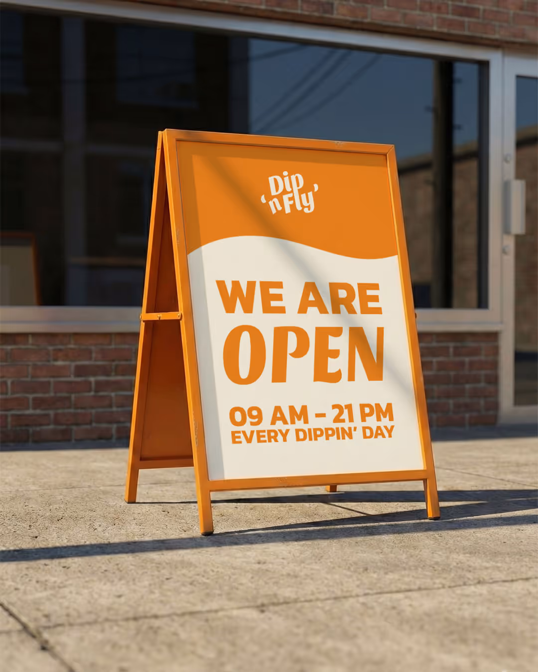
The result is a confident, sauce-forward brand system built to live consistently across packaging, marketing, and digital touchpoints.