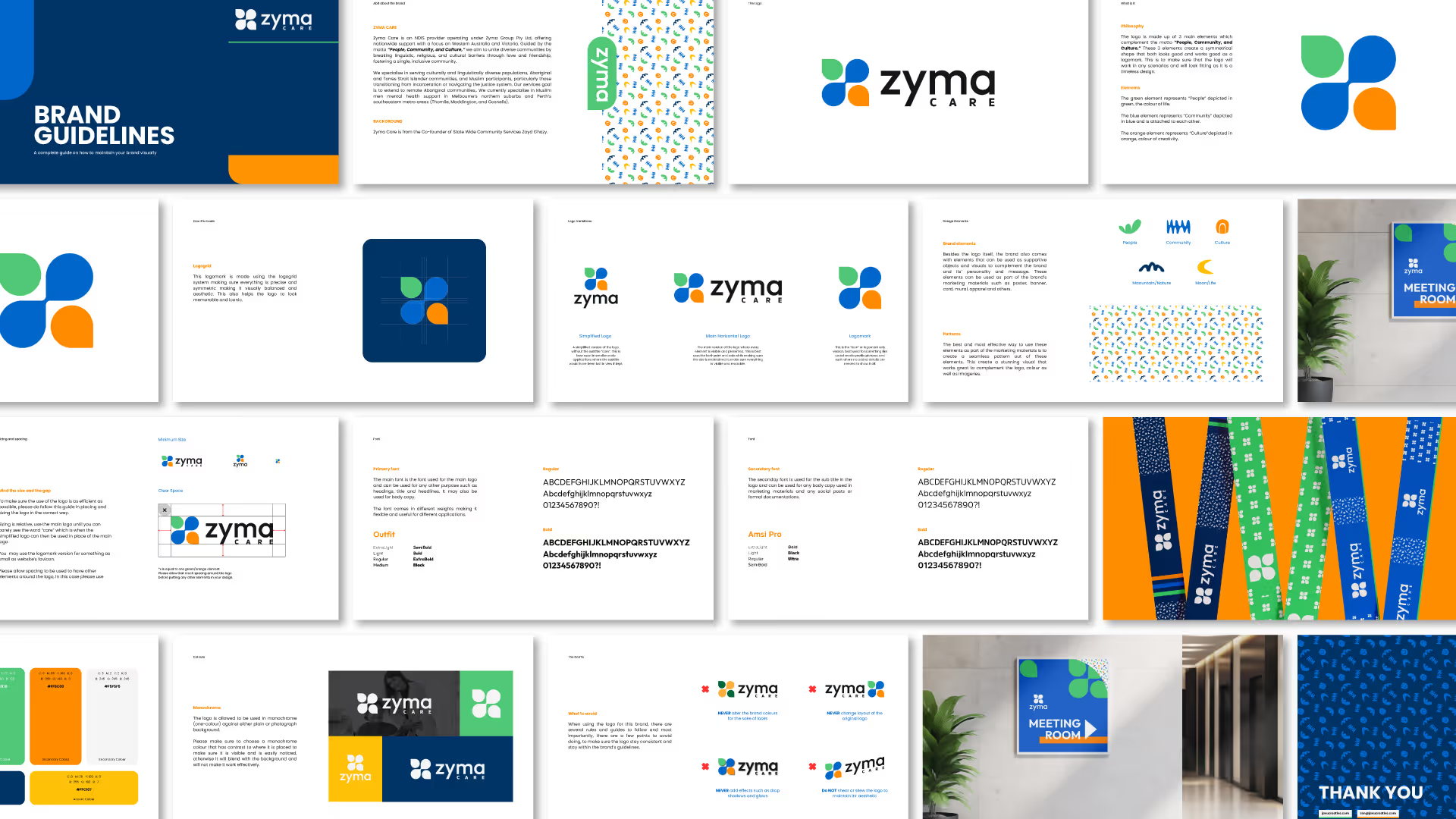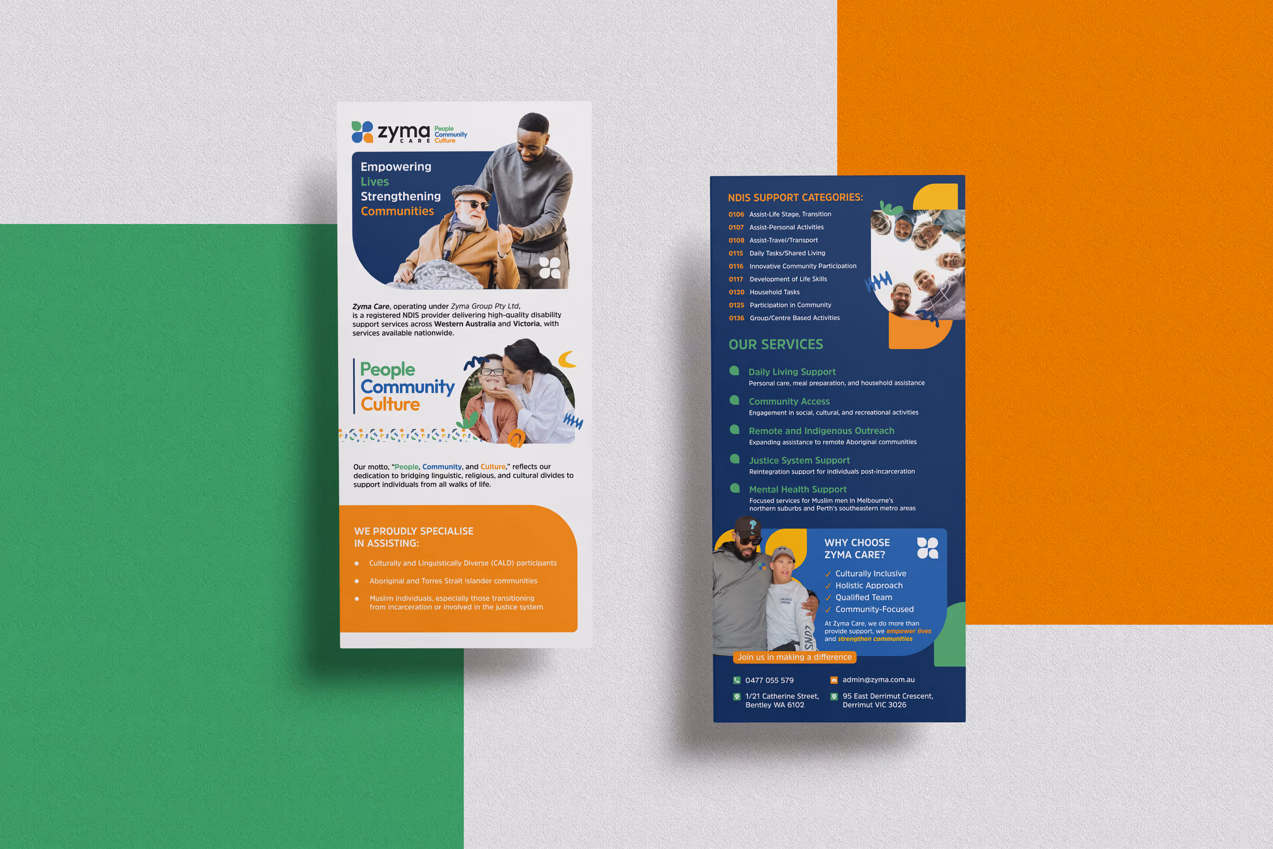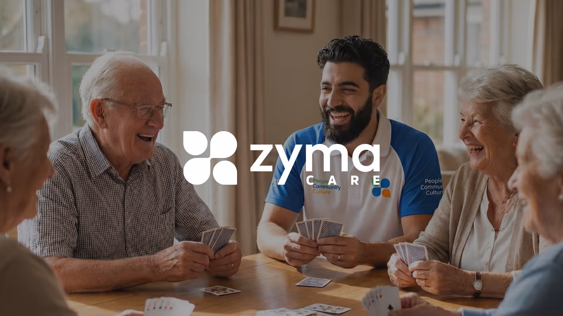
Zyma Care is an NDIS provider focused on culturally sensitive, community-driven support across Australia. The challenge was to create a brand identity that feels professional and trustworthy, while still being warm, inclusive, and deeply human.
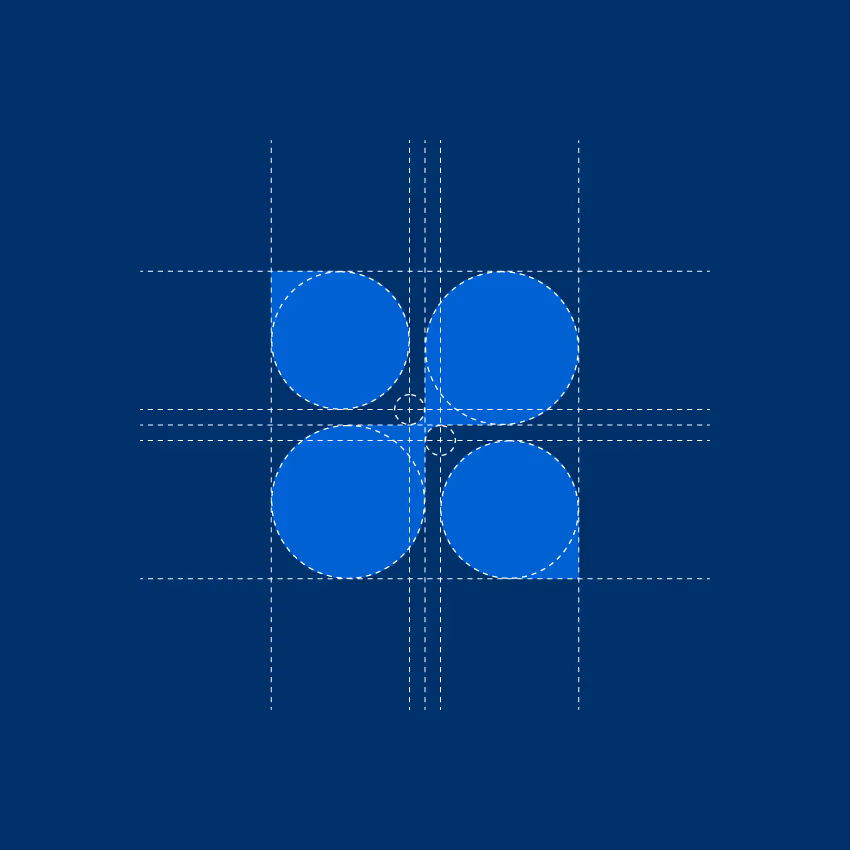
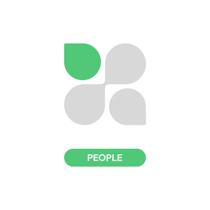
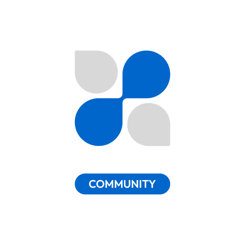
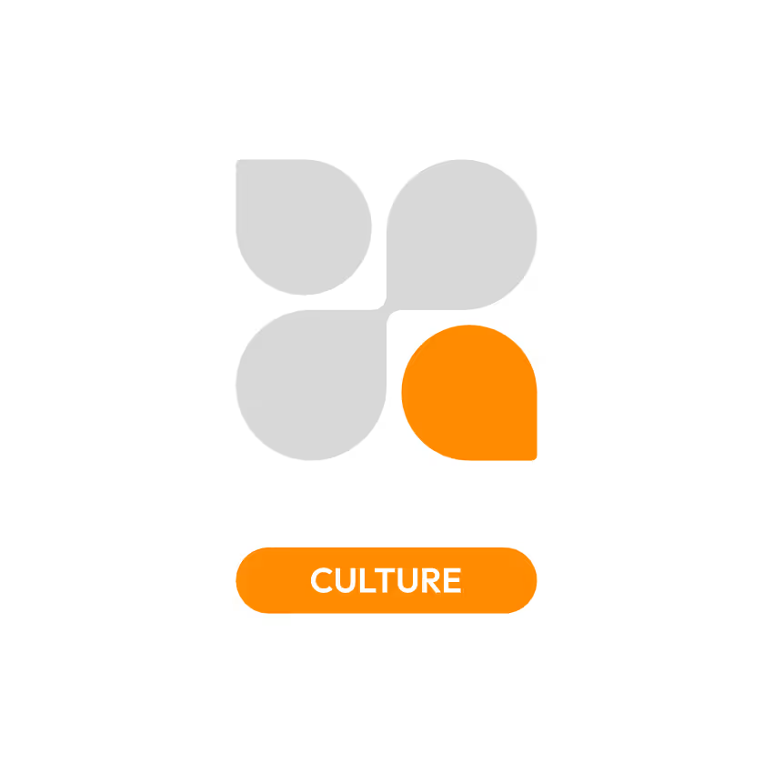
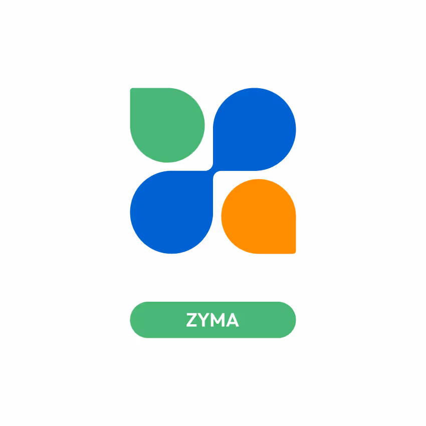
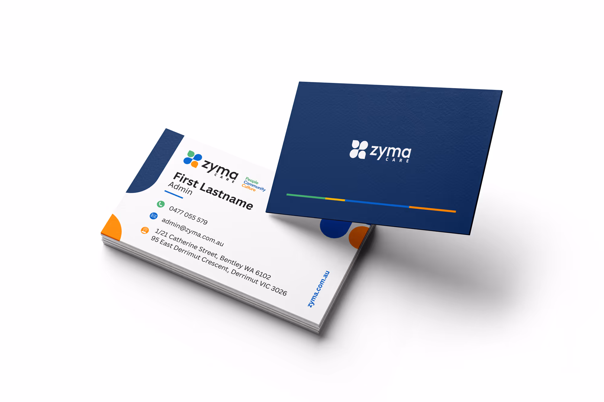
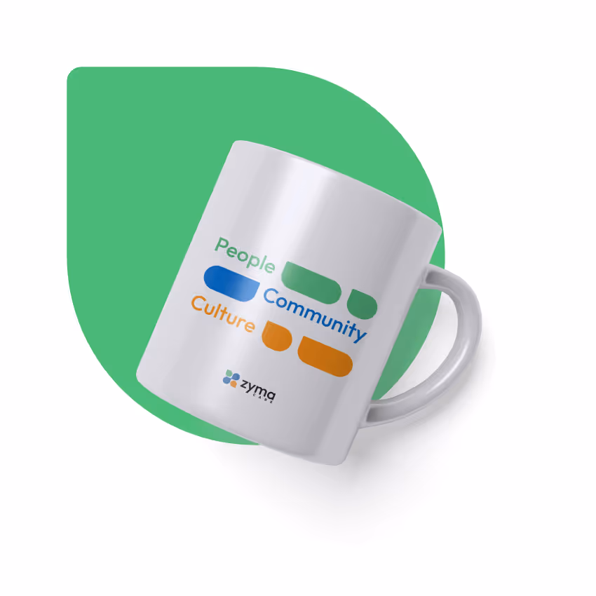
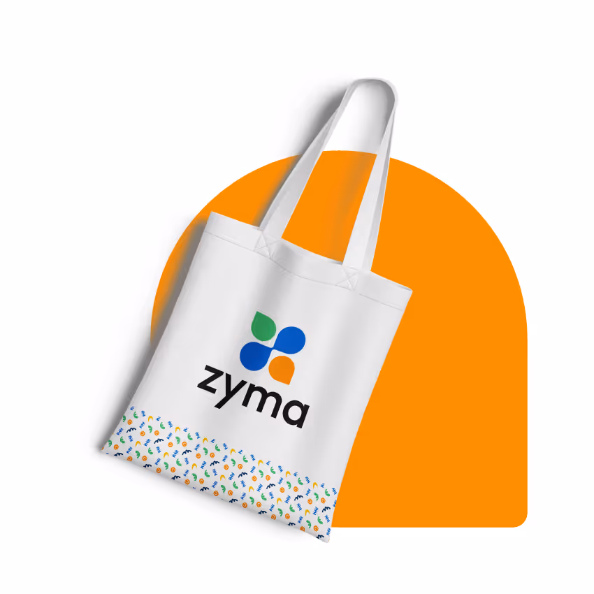
The visual system is built around Zyma Care’s core values: People, Community, and Culture. These principles are translated into a modular, symmetrical logomark that works seamlessly across digital and physical touchpoints. Each element carries meaning through color and form, ensuring the identity remains both symbolic and functional at any scale.
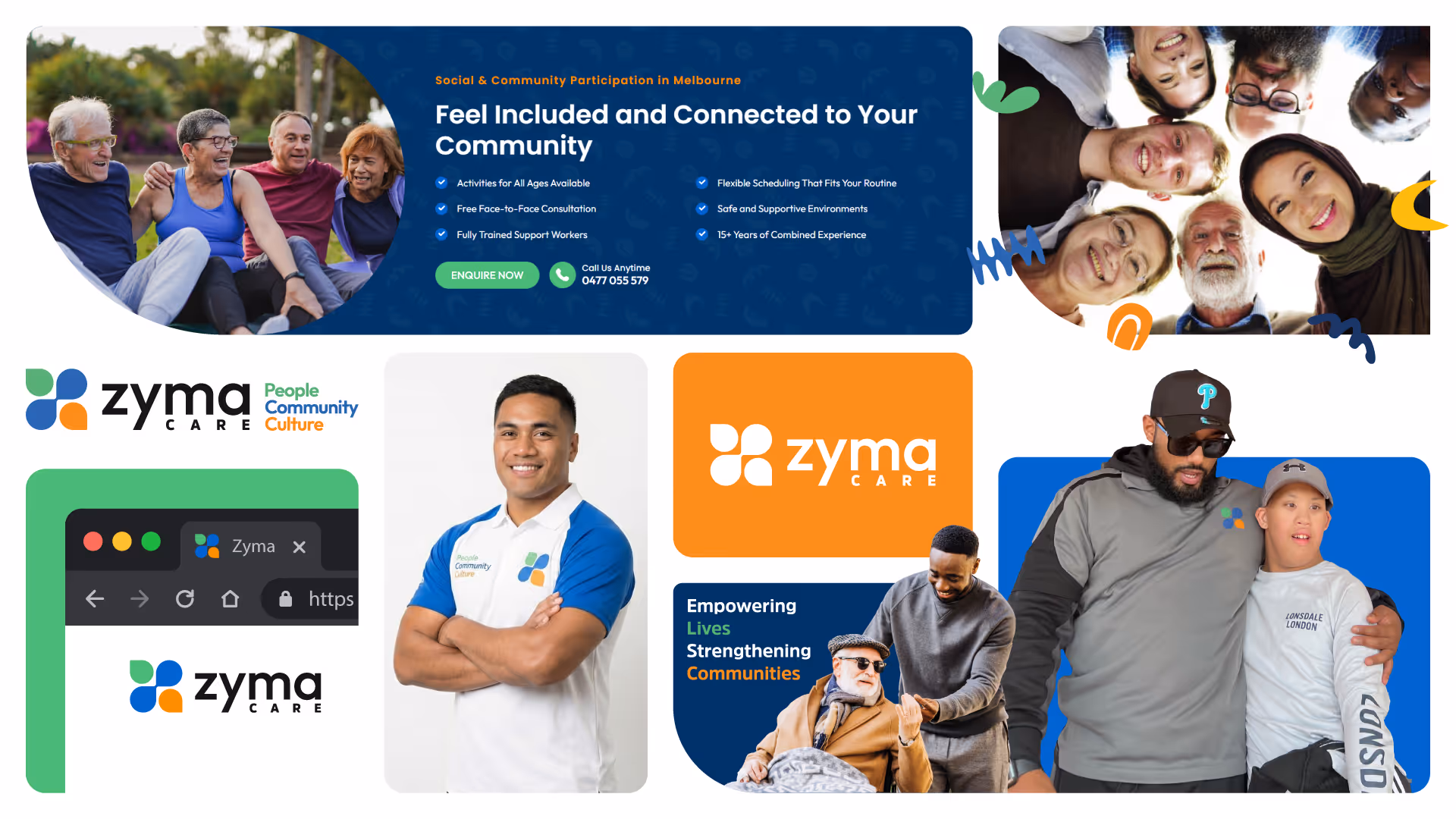
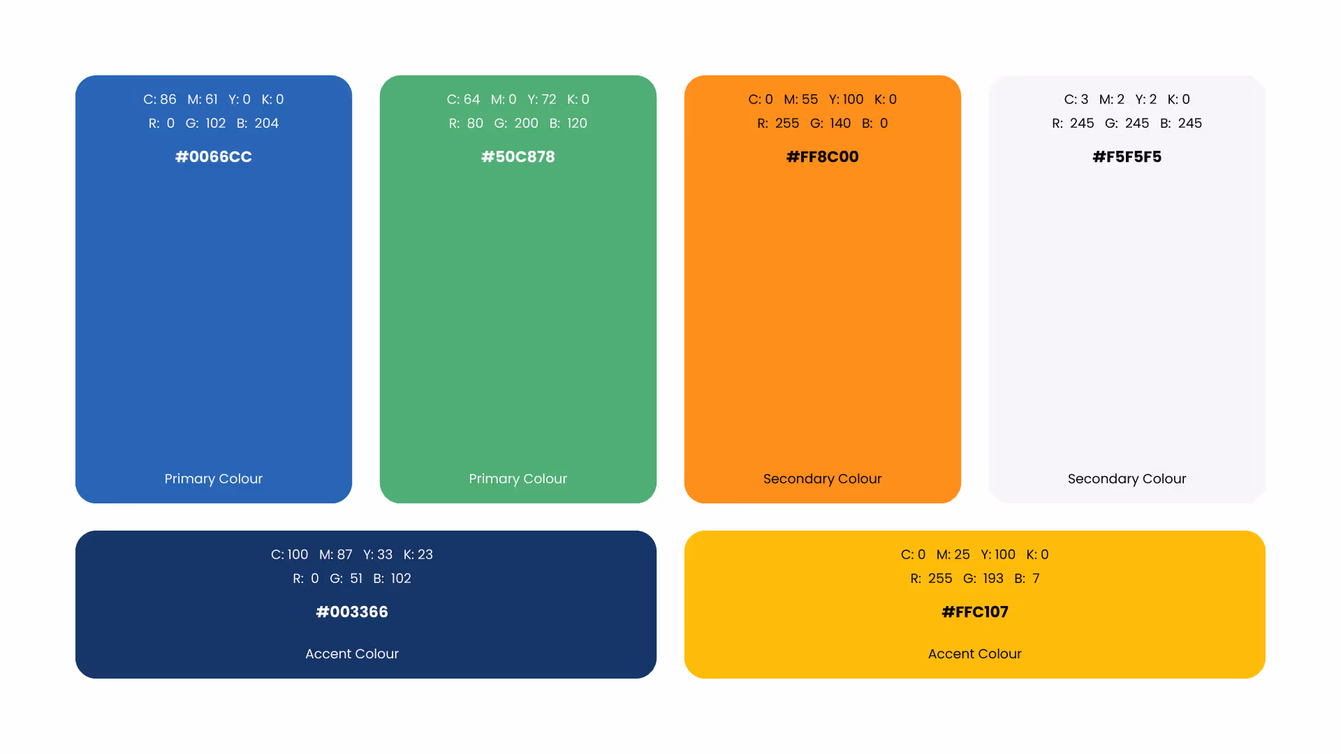
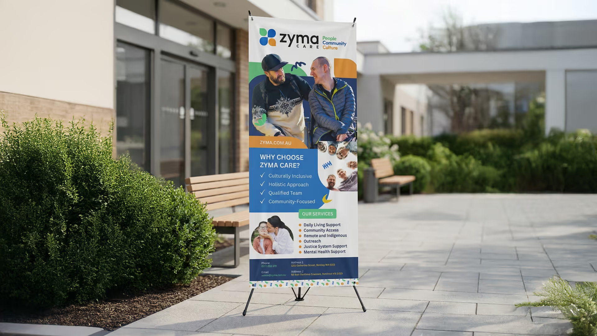
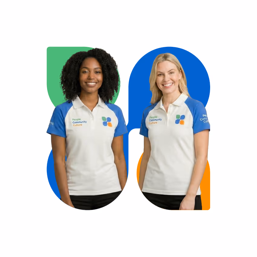
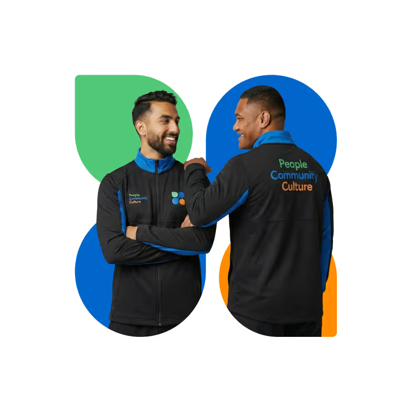
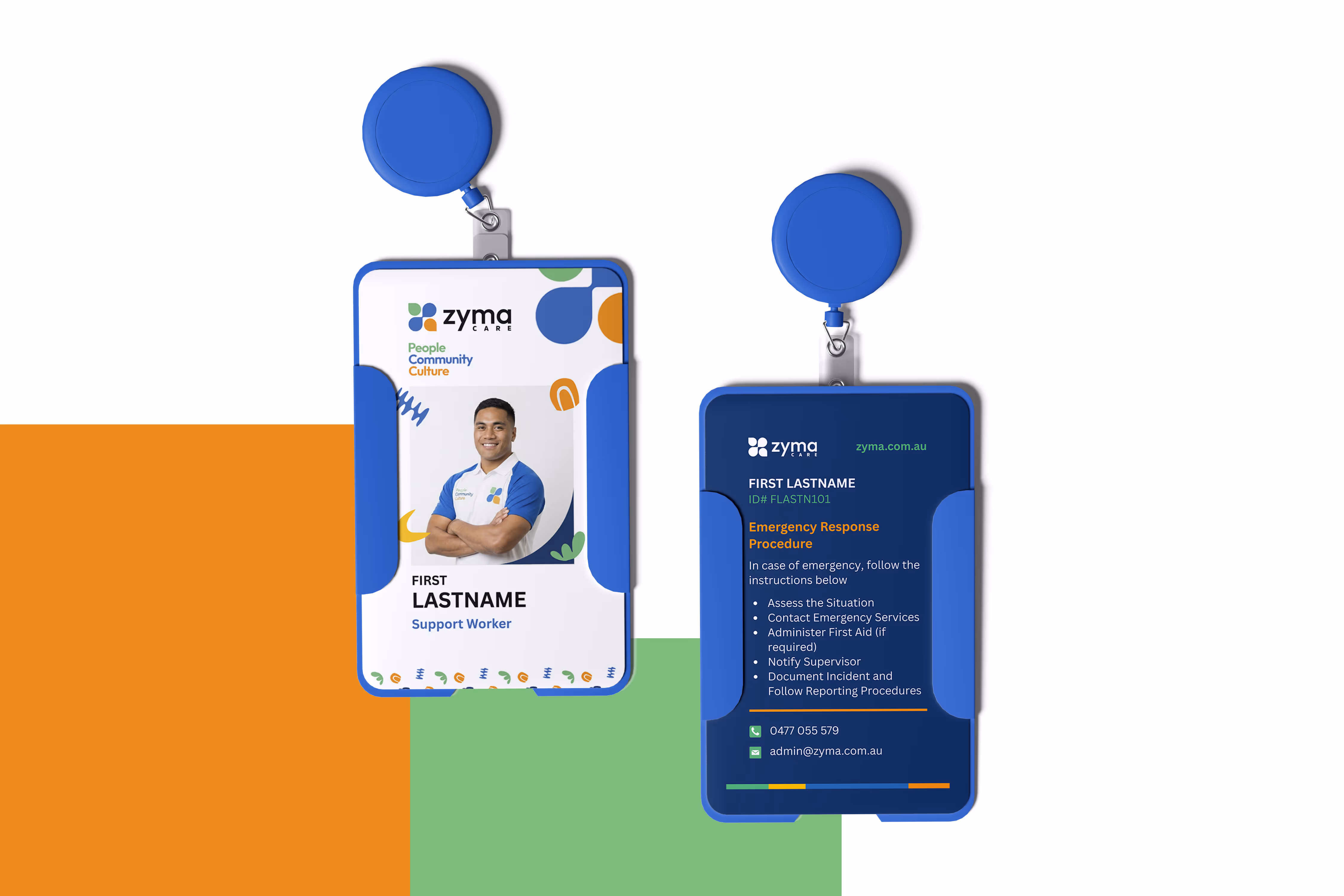
Beyond the logo, the brand system includes a carefully defined color palette, typography hierarchy, and custom graphic elements that can be expanded into patterns and environmental applications. The result is a flexible yet consistent identity that supports real-world use across signage, apparel, print materials, and digital platforms.
This project demonstrates how thoughtful branding can go beyond aesthetics to support inclusion, clarity, and dignity in essential community services.